|
|
Post by Livonia on May 16, 2006 21:00:02 GMT -5
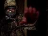
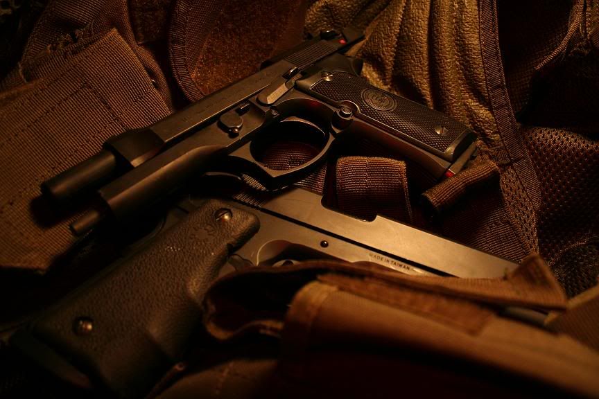 I encourage criticism. |
|
|
|
Post by Toothbrush on May 16, 2006 21:04:01 GMT -5
I'm impressed, looks great to me.
|
|
|
|
Post by Livonia on May 16, 2006 21:06:52 GMT -5
thanks tooth, the idea is more to have the M9 overpowering the 1911... oxymoron  |
|
|
|
Post by Toothbrush on May 16, 2006 21:09:06 GMT -5
thanks tooth, the idea is more to have the M9 overpowering the 1911... oxymoron Oxymoron indeed. The only thing I have noticed the more I look at it, would have been covering up the "made in Taiwan" some how. But no biggie in the end. |
|
|
|
Post by Livonia on May 16, 2006 21:10:56 GMT -5
yeah, its a KWC what can you expect.
|
|
|
|
Post by Orion on May 16, 2006 22:07:11 GMT -5
I'm not a photo nut in the least, but I'd say that's a great photo. I like the lighting.
|
|
|
|
Post by silentkilla on May 16, 2006 22:18:39 GMT -5
I like the lighting more than anything. I think the positioning could be a bit better, but still, its a damn good looking picture.
|
|
Rogue1
New Member
 TM-MK-23,SD-5,SD-51,MP-5A5,G-36c,MP-5K,MP-7,Beta-S,VFC HK416,Hudson M3A1,WA GSR,KSC G-18,USP-C
Posts: 839
|
Post by Rogue1 on May 17, 2006 11:31:45 GMT -5
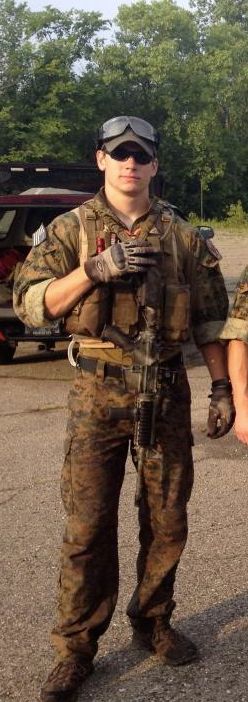
Graet pic Livioia! Close up the Beretta and throw in an Emerson CQC-7 folder and it's as good as anything in the gun magazines!
|
|
|
|
Post by MayhemXXXFrosty (AndrewMp5k) on May 17, 2006 13:15:27 GMT -5
I don't think you should have cocked the Beretta, but awesome pic none-the-less.
|
|
|
|
Post by Munin on May 17, 2006 17:15:27 GMT -5
I don't think you should of... Have. Should have. I Smite thee. Nice pic, Livonia. I too dig the lighting. |
|
|
|
Post by Knife on May 17, 2006 19:03:18 GMT -5
Great picture. I know you are trying to have the Beretta be the center of the picture, but to me the way the 1911 is covered up just looks goofy. The mag pouch is just to close to the camera, and so it is unfocused, which just looks odd. For a first attempt I say its great.
|
|
|
|
Post by MayhemXXXFrosty (AndrewMp5k) on May 17, 2006 19:50:20 GMT -5
I don't think you should of... Have. Should have. I Smite thee. Nice pic, Livonia. I too dig the lighting. Okay, sorry, ya caught me, I feel asleep in English today, leave me alone  . |
|
|
|
Post by Enkidu on May 18, 2006 15:16:54 GMT -5
livonia, you've done the hard stuff right on this one. So I'm going to critique the little things that'll make your further photography even better. Whether intentional or not, the foreground is very indistinct. This draws the eye towards the Beretta (which is good) and the detail on the vest (which isn't good). The vest details should be subdued in a shot like this - something as simple as turning it around so there are fewer details. It's good to get close to your subject as you have done, especially when it's as small as a handgun. But at close ranges, it can be difficult to manage the focussing. If you don't have a manual focus, try stopping down the lens for a wider focus range. You'll need more light and a tripod, but the results can be worth it. In this case, you'd be able to get all of the guns in focus. I find the color balance a bit too orange - almost monochromatic. Without context, the orange tint is thematically confusing. As it is a digital image, modification of the hue should be a snap. Here's my two-minute color-fix job:  Lighting intensity is right on - plenty of good shadow, contrast, and subject drama. The only thing I'd change about that is a very soft front light to bring out the details in the foreground.
|
|
|
|
Post by Gestapo on May 18, 2006 15:28:14 GMT -5
I actually liked that orange. Gave me a dimly lit warehouse image.
|
|
|
|
Post by O'Dwah on May 18, 2006 15:35:41 GMT -5
I also like the orange, it give's it a hazy look to it;Haze of war maybe...
|
|


 .
.